

Haarzicht Honey
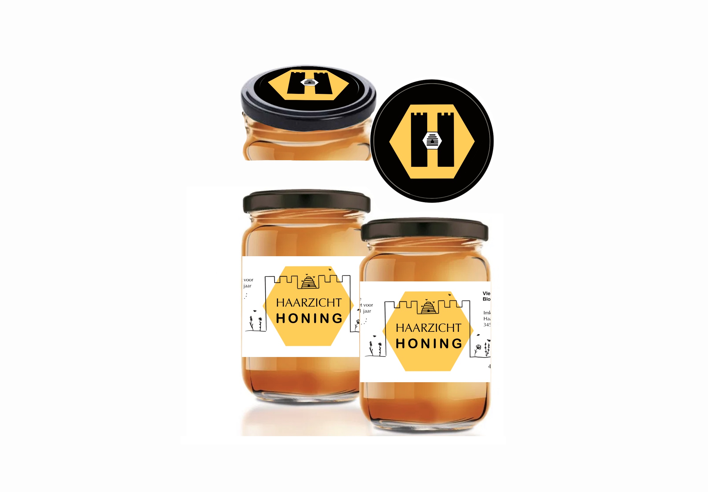
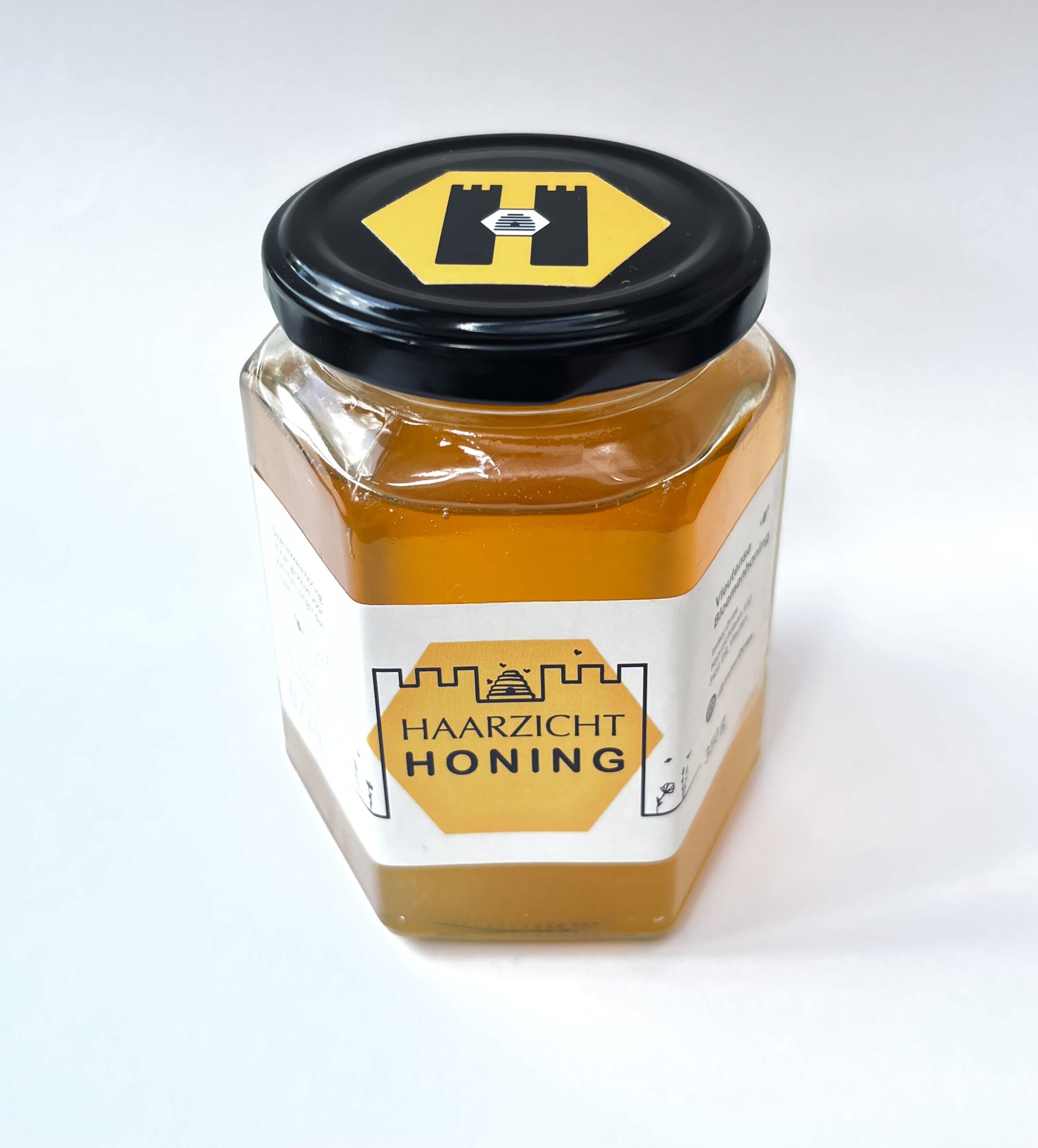
This sweet collaboration was with a local beekeeper from the picturesque countryside near De Haar Castle. I had the pleasure of designing both the logo and product label for their honey brand, Haarzicht. And as a delightful bonus — I now have a lifelong supply of honey!
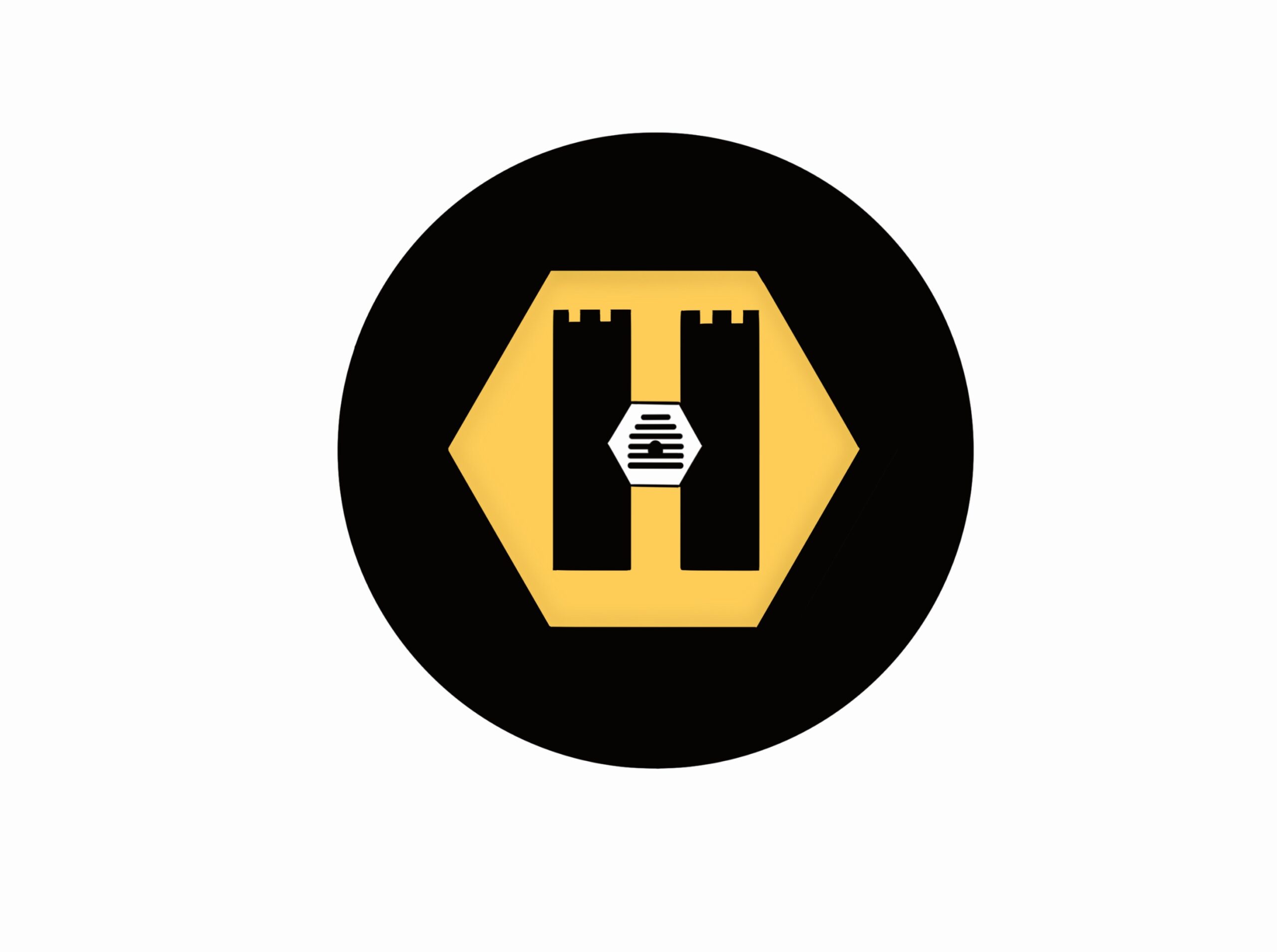
The design blends classical and regional elements: a traditional beehive, the iconic hexagon pattern of honeycomb, and subtle castle-inspired motifs that nod to the nearby De Haar estate. The letter “H” stands proudly at the heart of the brand, referencing both the name Haarzicht and the heritage of the area.
The result is a label that feels both timeless and rooted in place — just like the honey itself.
The label design echoes the logo without directly repeating it. Key elements — like the beehive, hexagon, and castle-inspired motifs — reappear in slightly altered forms, creating a sense of visual continuity while keeping the layout fresh and dynamic. These recurring shapes, reinterpreted with subtle shifts in style or scale, help tie the brand identity together across different formats without feeling redundant.
It’s a quiet conversation between logo and label — familiar, but never identical.